Carbonclick
Senior Product Designer
Verified Impact
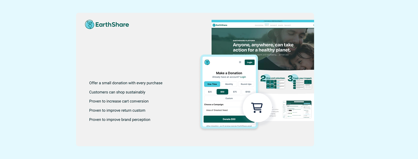
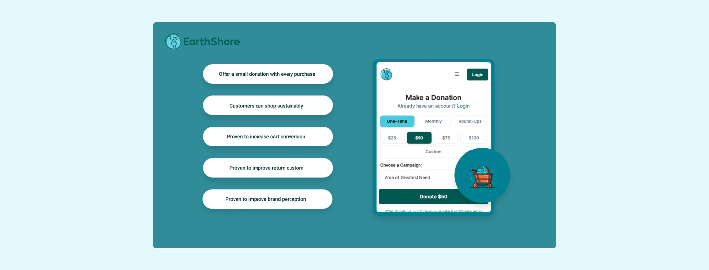
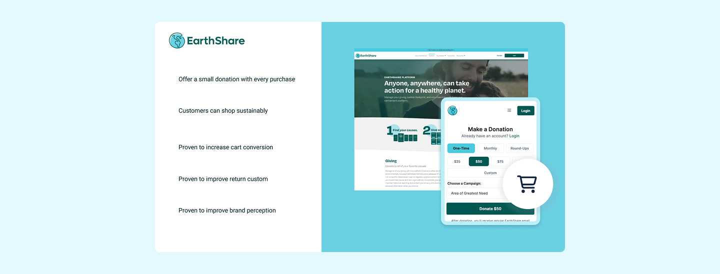
• Turned agency re-brand into a production-ready, CMS-driven ecosystem, dashboards that lifted consumer offset uptake from 40% to 88%.
• Designed white-label widgets and website pages, that let stores sell Sustainable Aviation Fuel certificates and forest credits to their customers in one click
Strategic Contribution
• Presented data-backed pricing restructure to C-suite; proposal approved for 2024 roadmap before engagement ended.
Role
Led end-to-end product design, stakeholder alignment, and engineering hand-off for a production-ready carbon-offset storefront and CMS
5 months
B2B2C | SaaS Platform
#NB CarbonClick is a startup company, I joined the company to work on their product. After failing to secure Series A funding, I decided to present to their founders a product and marketing strategy to improve customer signups and aim to meet key investor metrics. Here are my takeaways on how CarbonClick did and did not meet these key metrics and how they could turn this around.
The challenge
Making Carbon Offsetting meaningful
While climate consciousness was growing globally, our data showed that only 8% of users who expressed environmental concern actually completed carbon offset purchases.

The existing platform suffered from:

• Cognitive overload: Users couldn't understand carbon measurement units
• Trust barriers: No transparency in offset project verification
• Complexity paralysis: 73% drop-off during multi-step offset process
• Business impact: Low B2B customer retention due to poor dashboard experience
Stategic approach & stakeholder alignment
Cross -Functional Leadership
• Facilitated workshops with 6 stakeholder groups (stastainability experts, engineers, sales, executive team.
• Defined Product Strategy balancing user needs with business goals.
• Established desing system for scalable B2B2C experiences.
market Research insights
• Conducted competitor analysis across 5+ carbon platforms.
• Identified key differentiator: real-time impact visualisation.
• Established desing system for scalable B2B2C experiences.
technical constrains navigation
• Integration with payment providers across different markets.
• Real-time carbon credit pricing from multiple exchanges.
• Mobile-first approach for accessibility compliance.
Validation, Validation, Validation
CarbonClick like many startups don't put a lot of time aside for market research, competitor analysis, user research or user testing. This is key for any product to determine that what you are building is actually what customers want.
Pricing and value
A common strategy for Saas businesses is to create monthly subscriptions but you have to ensure customers are getting value for money for those subscriptions. Customer engagement is key and sometimes other strategies can work better for you and your customers. I suggested we upend our pricing structure and repackage out product into consumable bundles users could purchases as and when required.
Product Teams
Marketing Teams
Before you create ads, make sure you have an effective sales funnel and marketing strategy. This can really tell you so much about your product. I worked with the Marketing team to develop landing pages that would encourage users to sign up. However we needed to redefine our value proposition clearly to customers and I had some ideas on better ways to do this.
User interviews
Validate, Validate, Validate
When I joined CarbonClick, there had been no structured user research in the company’s first three years. Product decisions were largely informed by ad hoc sales feedback and externally commissioned research focused on the marketing website. While useful, these inputs were inconsistent, unvalidated, and limited to existing customers, leaving a major gap in understanding non-customers and unmet needs.
I introduced a formal user-research approach, starting with internal interviews across Sales and Marketing to consolidate existing knowledge and align insights with the product roadmap. I then proposed and led a customer-validation strategy, interviewing both current customers and businesses in our target market who had not yet adopted CarbonClick.
This work focused on validating real problems, understanding carbon-offsetting awareness, and testing expectations around features, pricing, and messaging. By grounding product direction in validated user needs rather than assumptions, this research established a stronger foundation for engagement, growth, and investor confidence.
Personas vs Thinking Styles
We held a number of workshops to identify our customer by creating user personas and user journey maps. I also created some Thinking Styles to emphasises the importance of understanding behaviour and thinking rather than relying on demographic factors, such as age or gender, which can lead to assumptions. It suggests using cognitive empathy to grasp the mindset of individuals pursuing their goals and highlights how thinking styles can vary based on different circumstances. This approach aims to capture the train of thought and emotions during a person's journey, recognising that thinking styles may change throughout. This understanding helps to create a flexible user experience that accommodates shifting priorities and diverse perspectives.
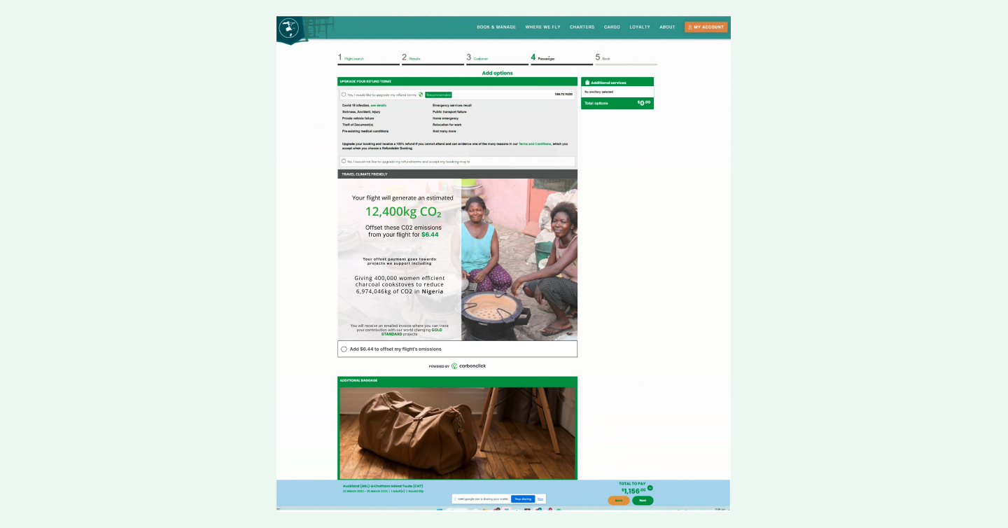
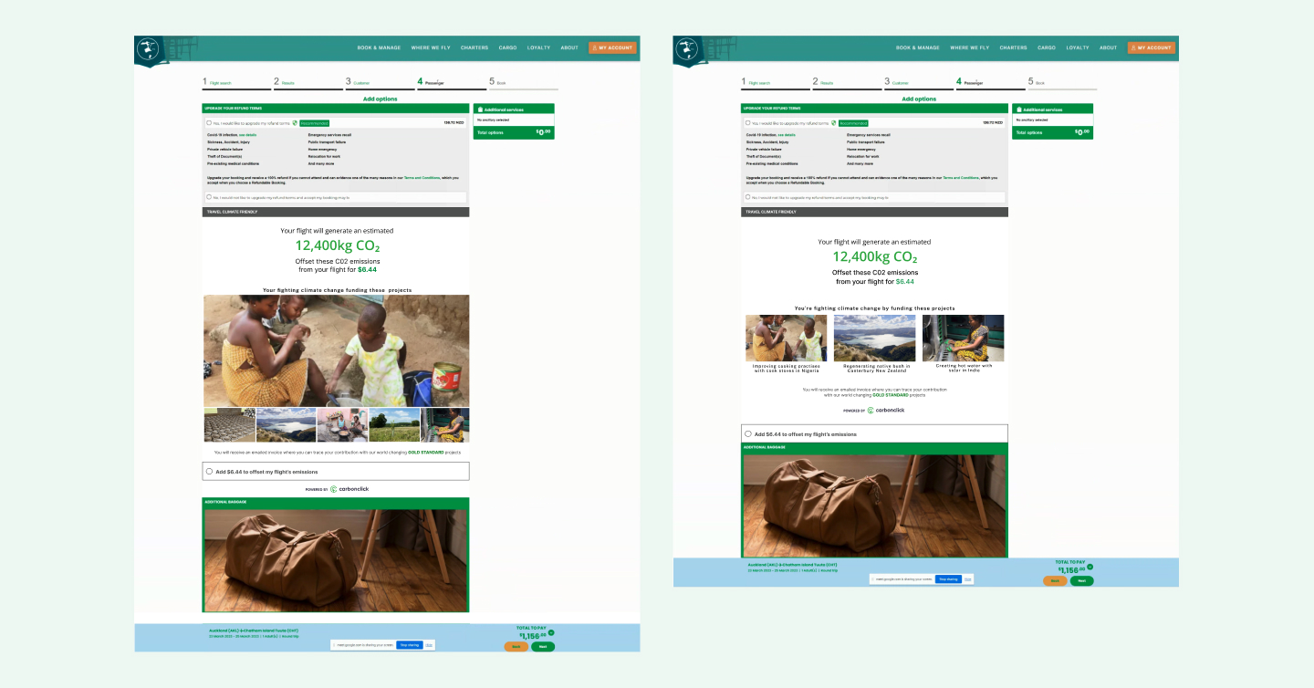
Examining Carbon Click's App
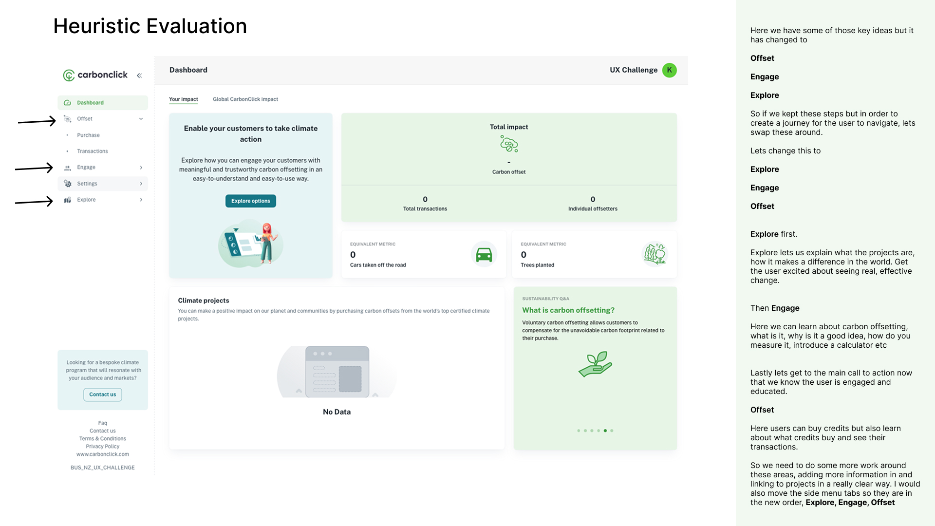
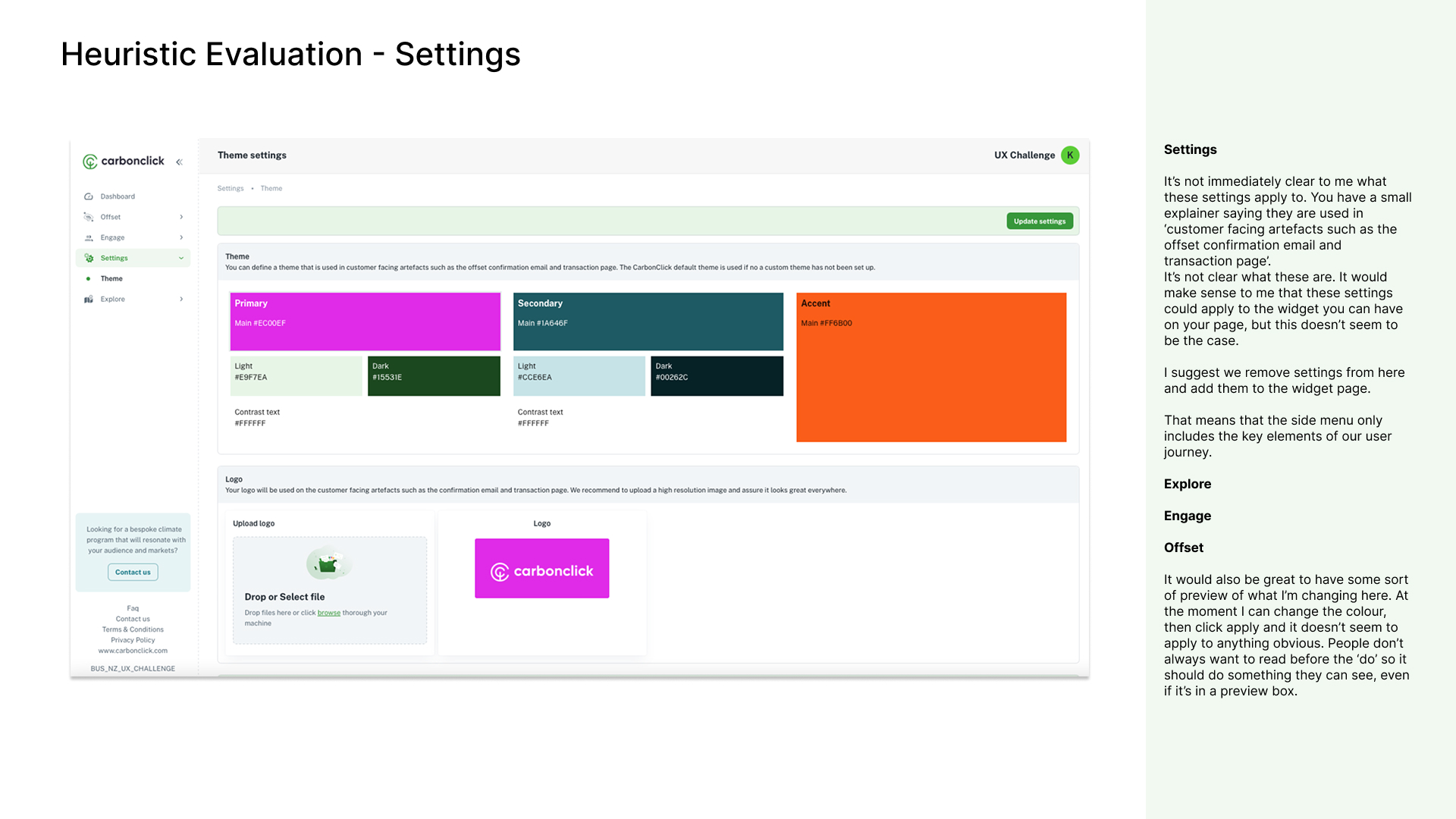
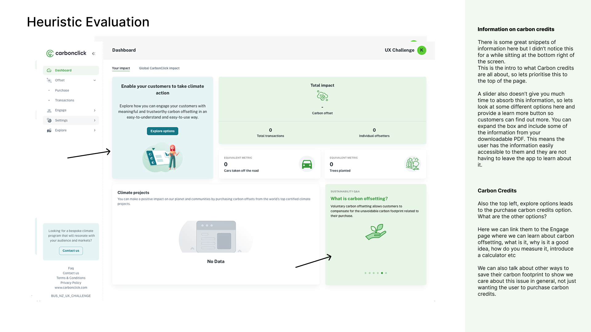
I conducted a heuristic evaluation of Carbon Click's app and these were some of my key findings.
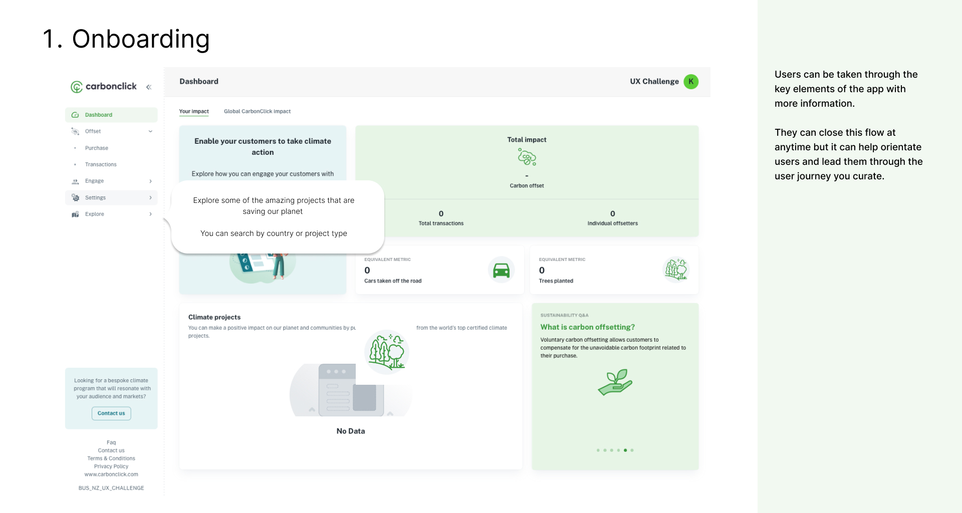
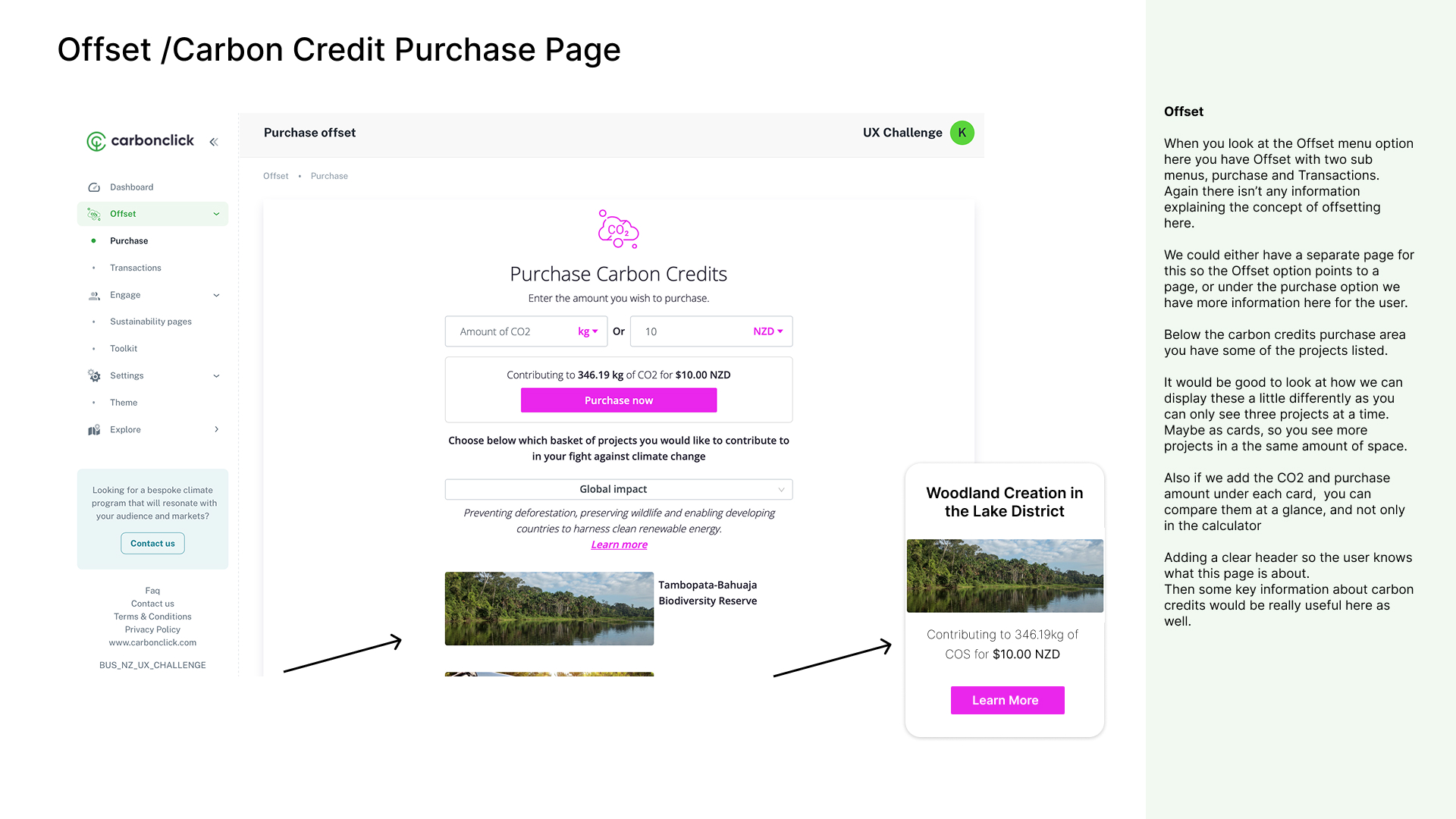
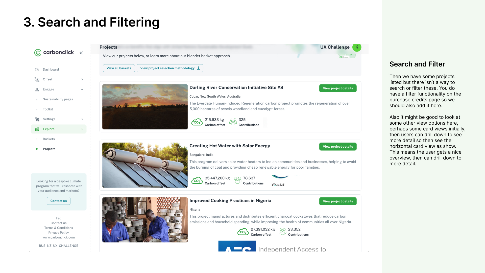
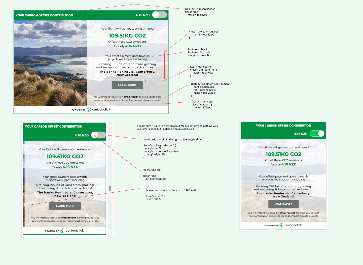
1. Instructions needed to be better explained for users. There were assumptions that users knew about widgets and how to implement them.
2. Key statistics were not explained anywhere. What is KG of CO2? Offset by who? if these metrics related to a customers business, this needed to be really clear to the customer.
3. Carbon Click methodology was stuck in a downloadable PDF. Although this had a tonne of information, this information needed to be better integrated into the website. I.e benefits, summary, criticisms, offsetting criteria etc.
This helps to build self onboarding and makes it easy for customers to see relevant information and not read through an essay of information in a download. I went through each page and noted what worked, what needed reviewing and why.
Understanding our User's Needs
Since CarbonClick had not conducted structured user interviews before, I took the initiative to begin by engaging with the Sales and Marketing teams. My objective was to gain insights into the feedback they had been receiving from our existing customers. I conducted face-to-face interviews, employing open-ended questions to understand how they collected and relayed customer feedback. This exploration aimed to identify our customers' pain points, user goals, and the reasons behind their choice to collaborate with CarbonClick. From these interviews, I synthesised the information into an empathy map.
This served as a starting point to develop a strategy for effectively reporting valuable feedback and establishing a structured approach for customer insights and subsequent user interviews with customers.
Market research
Saas and the Subscription Siren Song
The acknowledged problem by CarbonClick was that most of their subscription plans didn't offer enough value for money to keep customers engaged (and paying) long term. Although they knew some of the solution was to create more news, blogs and information on the website and create social media resources, it was never undertaken.
Part of my plan to improve the product was to upend the existing subscription pricing plan for SMEs from $99 per month and $399 to just $99 per year for all small businesses.
Then each value would be to include bundles the user could purchase as and when they wanted to.
The user flow would be, Once a business has used the business offset calculator to work out their emissions and has offset them. We certify their result. Then they can purchase a ‘Climate Warrior Recognition’ for let’s say $199 (pricing subject to user testing). Then we can package these up for different use cases.
I drew inspiration from a current CarbonClick employee witht the title 'Climate Warrior at CarbonClick'. I believed it would be great to capture this same energy and spirit within our CarbonClick products and move away from its current name, 'tile,' which evoked thoughts of a bathroom floor covering. Thus, the new name, 'Climate Warrior Recognition,' aims to inspire the same sense of enthusiasm and foster positive change, aligning with CarbonClick's core values

ideating/solutions
How might we?
In my presentation to CarbonClicks founders, I suggested some more ways we could expand on the idea of bundles beyond our existing products.
In addition to reconfiguring the Recognition badges, I proposed the idea of bundling social media kits that include various templates for different platforms. This encompassed creating 25 story frames and post templates for Instagram, 25 Facebook banner and ad templates, 25 LinkedIn banner and carousel templates, and more. This initiative aimed to simplify the process for our SMEs in conveying their sustainability story to their customers, as we took care of the heavy lifting. Moreover, it proved advantageous for us since once these templates were created, the overhead was minimal, allowing us to offer these bundles repeatedly to different customers and update them for new events. I also suggested applying the same approach to media kits.Ensuring customer engagement stood out as a crucial metric for investors, prompting my suggestion to transform the portal from an administrative solution, like Google Docs, into an information hub resembling a magazine. This revamped platform would feature an array of articles, blog posts, tips and tricks, and valuable tools tailored for SMEs to amplify their sustainability message to their customers. By setting a price point of just $99 per year, we established a low barrier to entry, encouraging more businesses to join and bolstering our new customer statistics. Simultaneously, our focus on creating high-engagement content addressed the imperative metric of sustained customer engagement, successfully mitigating the issue of customer attrition after six months, which had been a concern at CarbonClick.
To enhance our marketing strategy, it was imperative to align it with the key value propositions that resonated with our customers. We aimed to provide transparent information about what they would gain from their investment and how it directly aligned with their specific user goals. Instead of solely focusing on CarbonClick's values, we acknowledged that our customers had their own distinct values and objectives.
Workshops and Figjaming
Several aspects of the CarbonClick product underwent thorough examination and reorganisation. Through a series of workshops, we mapped out these new iterations and user journeys. The focal points encompassed various critical areas, such as exploring innovative pricing plans, refining payment journeys, optimising product pillars and programs, and creating comprehensive blueprints for customer onboarding.
mid-fidelity wireframes
Unleashing New Concepts and Brand Design Simultaneously
As we embarked on implementing and designing a fresh concept of programs and blueprints for customers to sign up to, we simultaneously integrated the new branding design.
prototype / High fidelity wireframes
Interactive Prototyping for devs
I created a plethora of Figma prototypes to demonstrate micro interactions for the engineering team. This eliminated the need to extensively describe functionality through lengthy essays within Jira tickets, streamlining the communication process and expediting development efforts.
Reflection & COntinuous improvement
Key Learnings
• Trust is the currency of sustainability platforms. Every design decision must reinforce credibility.
• Behaviour change requires both emotional connection and practical utility.
• B2B2C platforms need sophisticated role-based experience design.
• Environmental impact must be immediately visible to drive engagement.
• Pricing tiers should be able to be versitile and accessible.
• The product should be easy to understand and consume.
• You have to sell more than just credits, you have to provide customisation, community and add on features to sell your core product.
What I would do differently
• Implement more sophisticated A/B testing for behaviour change features
• Create in software surveys and conducting user interviews with customers was my next step.
• Create more granular impact tracking for different user segments
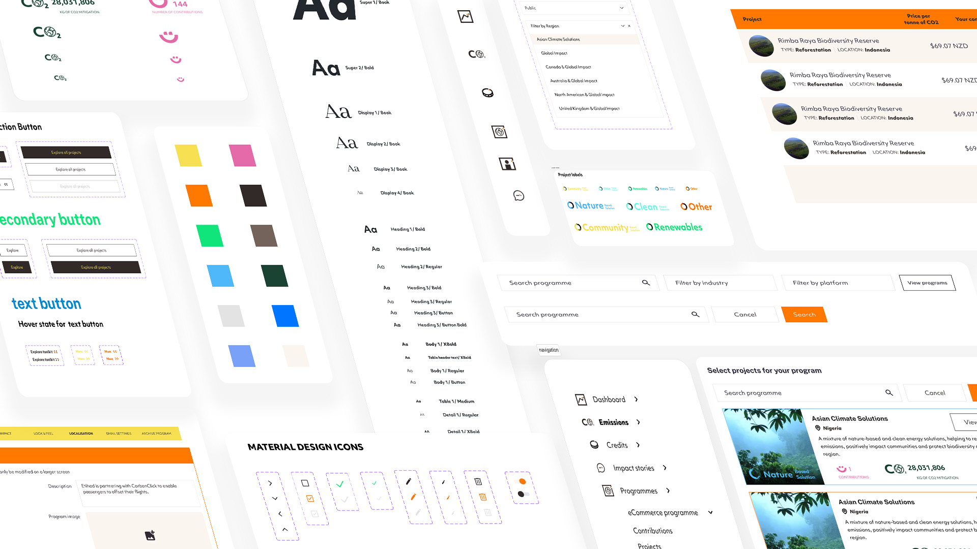
styleguide
'AndNow', a website branding company, had previously designed the front-end website for CarbonClick as they were undergoing a rebranding effort prior to my involvement. My role was to incorporate the front-end branding into the product design, ensuring consistency between the website and the product while infusing a contemporary touch.
To streamline the redesign process, I also developed a new style component library in Figma. Throughout the rebranding process, careful consideration was given to collaborate with the development team in order to avoid disrupting existing product styles and maintain a cohesive experience. The rebranding was executed gradually, focusing on one component at a time, starting with the side navigation, header, and buttons, followed by forms, icons, text, and so forth, until the entire product seamlessly transitioned to the new brand identity.


.jpg)


.gif)
.png)